3.5. WYSIWYG Editor

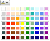
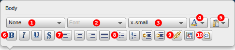
When you edit content in an editor element, a tooltip containing WYSIWYG controls appears, allowing you to style and manipulate the element's content in a number of ways. Most of these controls require you to first select some text, then operate the control. Hover your mouse over each of the numbered callouts to highlight the associated area of the tooltip.

(1)

Format: This control lets you choose a markup format for the selected text, including Paragraph, Heading, Subheading, Sub-subheading, and Pre-formatted.

(2)

Font: This control lets you choose a font for the selected text, including Arial, Times New Roman, Comic Sans MS, and Courier New.

(3)

Text Size: This control lets you choose the size of the selected text, including xx-small, x-small, small, medium, large, x-large, and xx-large.

(4)

Text Color: This control lets you choose the color of the selected text:

(5)

Paste Mode: This control lets you choose how pasting text into the editor works:

"Standard Paste Mode" attempts to maintain the formatting and styling of the text when it is pasted. "Plain Text Paste Mode" attempts to remove all formatting and styling from the text. After you select a paste mode, the control's icon changes to reflect the current mode.

(6)

Text Style: These four controls let you toggle a style of the selected text. From left to right these are boldface, italics, underlined, and strike-through.

(7)

Text Alignment: These four controls let you align the selected text. From left to right these are flush left, center, flush right, and flush left and right.

(8)

Create Lists or Adjust Indent: The first two controls in this area let you create bulleted or numbered lists with the selected text. The second two controls respectively increase or decrease the indentation of the selected text.

(10)

Toggle Source Mode: This control toggles the rendering of the element's content from WYSIWYG mode to source mode. This is useful when you need to customize the HTML markup embedded in the content.

3.5.1. Creating Links

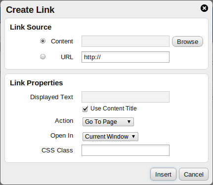
The Create Link dialog appears when you click the Link control in the WYSIWYG tooltip.

Link Source
You can choose to create a link to content already entered into Chronicle, or any URL you choose. Click Browse to list existing content entries for the selection.
Link Properties
These settings allow you to control the appearance and behavior of the link.
  • Displayed Text is the text that appears to be linked.
  • Use Content Title (only available when the Link Source is 'Content'), when checked, causes uses the content entry's title for the Displayed Text.
  • Action (only available when the Link Source is 'Content') determines the link's action to display the content entry's page, display the content entry as an image (also works for PDFs), or download the content entry.
  • Open In allows you to control whether the link opens in the current browser window, a new window, or another existing window.
  • CSS Class allows you to use a stylesheet to customize the appearance of the link.

3.5.2. Inserting Images

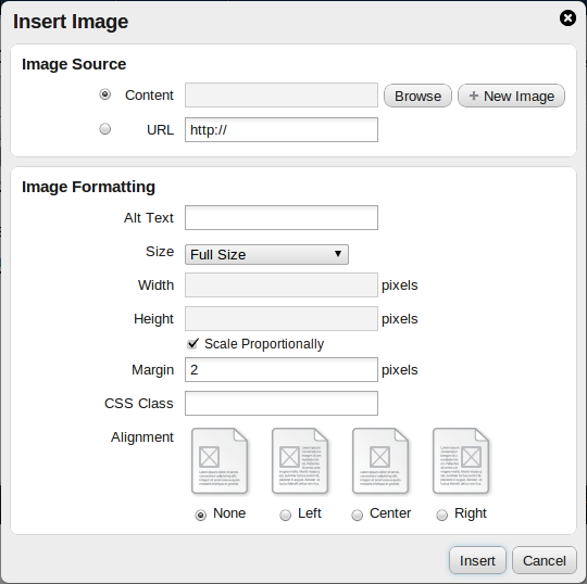
The Insert Image dialog appears when you click the Image control in the WYSIWYG tooltip.

Image Source
You can choose to insert an image content entry, or an image at any URL you specify. Click Browse to list existing images for the selection, or click New Image to upload an image thereby creating a new content entry.
Image Properties
These settings allow you to control the appearance and positioning of the image.
  • Alt Text is the text that appears in a tooltip when the mouse is hovered over the image.
  • Size lets you choose to display the image at Full Size, or Custom Size. The Width, Height, and Scale Proportionally are disabled until you choose Custom Size.
  • Width allows you specify the width of the image. Requires that Size be set to Custom Size.
  • Height allows you specify the height of the image. Requires that Size be set to Custom Size.
  • When checked, Scale Proportionally affects the Width and Height values to maintain the shape of the image; if you are entering a width, the height is automatically updated to an appropriate value, and vice-versa. When this property is unchecked, you can use the Width and Height values to change the size and shape of the image.
  • Margin allows you specify the amount of space that should appear between the edges of the image and the surrounding text.
  • CSS Class allows you to use a stylesheet to customize the appearance of the image.
  • Alignment allows you specify how the image is aligned with the surrounding text.

[Note] Server-Side Image Resizing

If the web server hosting Chronicle has a supported PHP image library installed (see Chapter 16, Image Manipulation for more details), local images with a specified width/height are resized on the server to minimize data transfer and improve page load time.

Perforce Chronicle - Release: 2012.2/486814